Elliot Prevost
Elliot is an enthusiastic, passionate and mature designer with an eagerness to learn and evolve into the best designer he can be. With a strong interest in popular culture such as sports, music and film a lot of his recent work reflects these interests in a range of different types of outcomes, whether it is typography, UI, information design or other outcomes. In every example he is very focused on producing contextually informed and effective design within every piece of work including those outside of these personal interests. As a versatile designer he values the importance of developing and producing each individual project with the appropriate tools and skills that best compliment the project at hand.

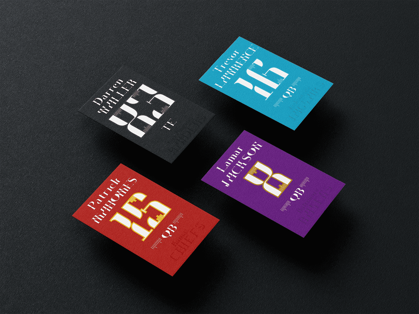
Grassroots Type Specimen – I designed this typeface with the intention of letting the sport of american football dictate the aesthetic of the typeface rather than the conventions surrounding existing typefaces used in sport.

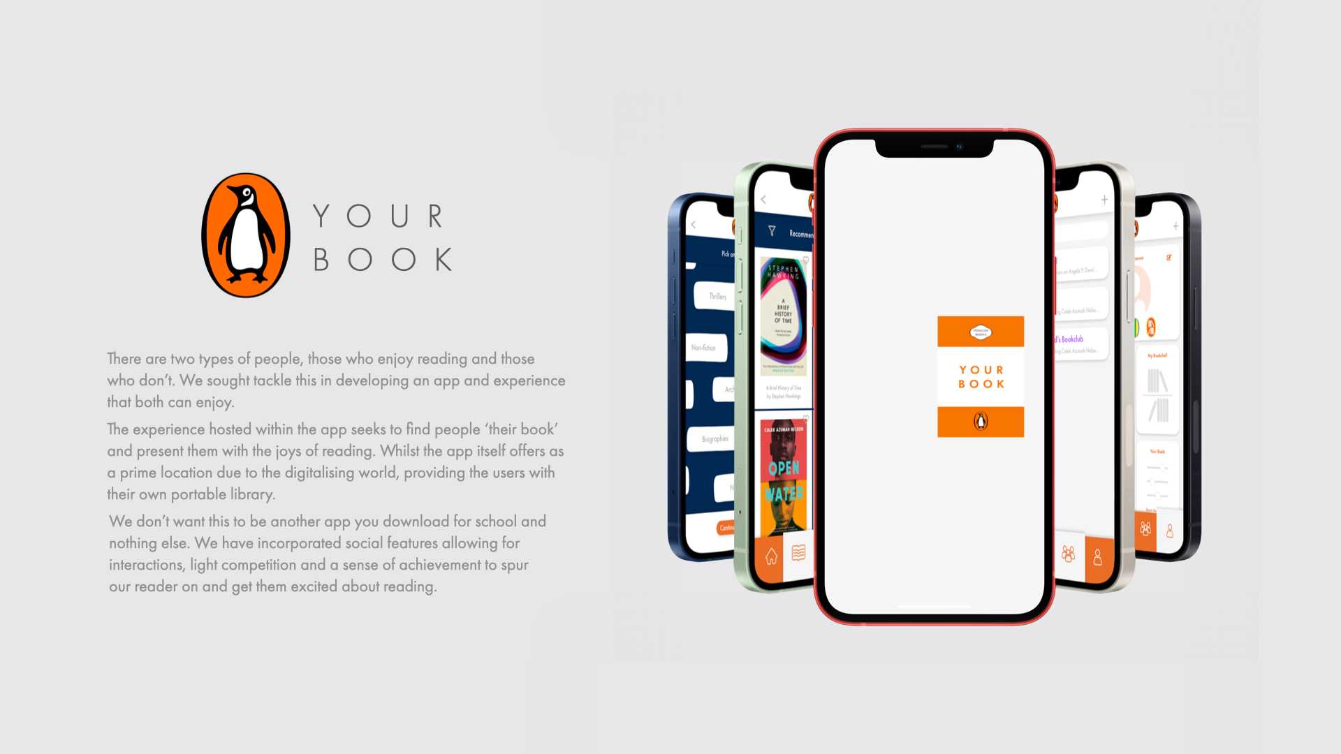
Penguin - Your Book – This project was about finding a way to engage children and young adults in reading. The way that our group decided to do this was through an app that included an individual, personalised approach that started with an interactive experience designed to gather information about the personal interests of the user.

"Impose" Typeface – I designed this typeface in a way that allows the characters to be complimentary to each other. The process drew influence from typefaces used in the fast food industry and therefore has a focus on promotional purposes.

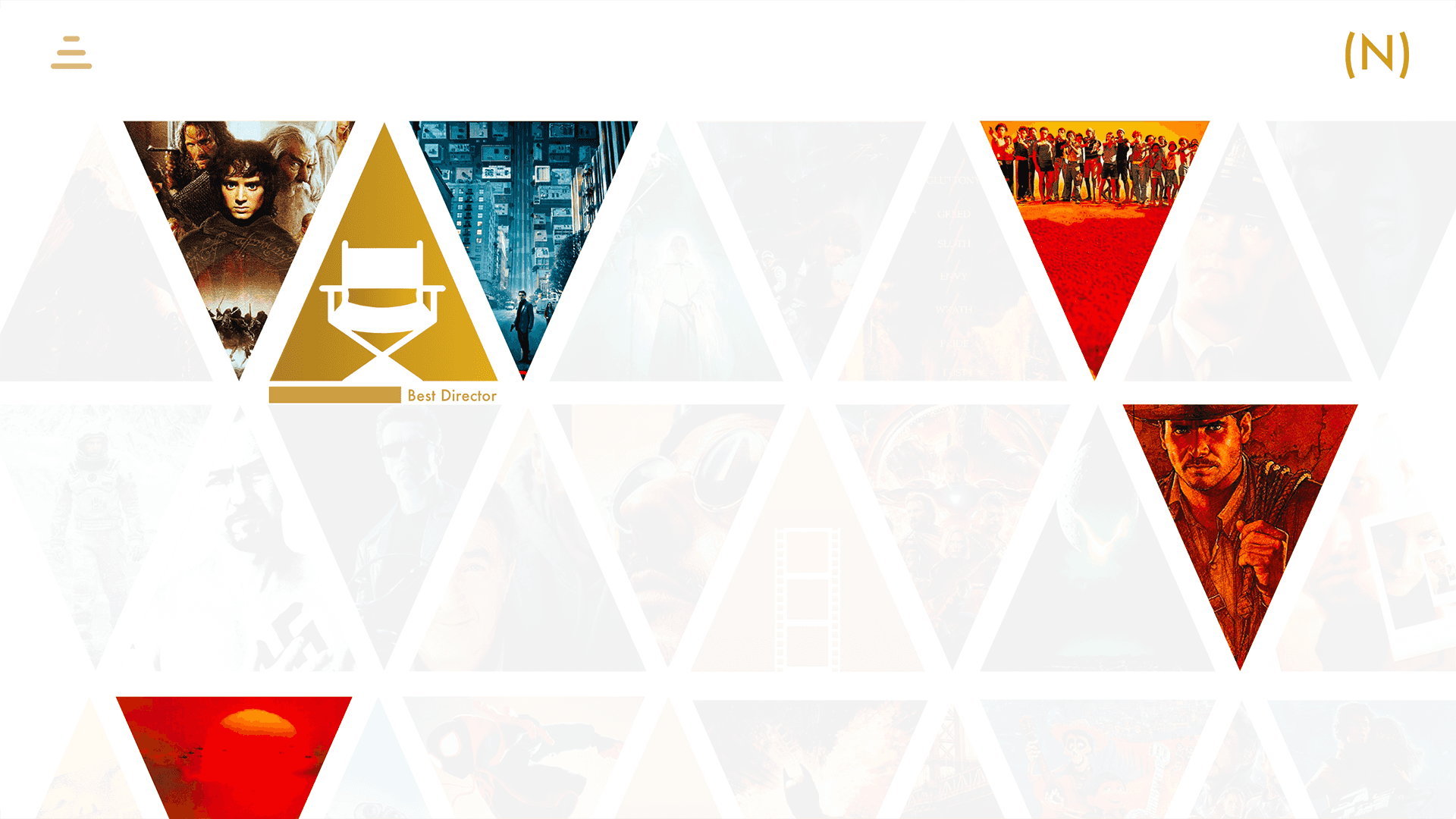
This is an interactive and infographical experience where I took a collection of the top rated films since the 1970s and designed an experience that takes the user on a journey showcasing some of the top rated and iconic films in history that have missed out on academy awards (Oscars) and which films won in place of them.

My Life in Progress – This is small clip of an animation I created that showcases the amount of time the average person spends doing everyday activities throughout their lives. The brief was simply the concept of time and so the intention was to convey that concept in the form of progress/loading bars, contextually designed to represent their perspective activities/ pass times.